Retro Kitsch Teal
Color is an essential part of our visual world, and while we often use terms like teal, turquoise, aqua, and cyan interchangeably, they each represent distinct shades with unique characteristics. In this blog post, we’ll dive into the differences between these captivating hues and explore how they can be utilized in design, fashion, and art.
What Are Teal, Turquoise, Aqua, and Cyan?
Before delving into the specifics, it’s important to note that color perception can be subjective, and the boundaries between these shades can sometimes blur. However, here’s a closer look at each color:

Teal
Teal is a medium to dark blue-green color, sitting between blue and green on the color wheel. It is a versatile shade that evokes a sense of calm and tranquility. Teal is often associated with nature, particularly bodies of water, and can range from rich and deep to lighter, more muted tones. In design, teal can add sophistication and depth, making it a popular choice for interiors and branding.
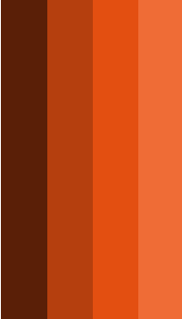
Usage in Design: Teal works beautifully as an accent color in both modern and traditional spaces. It pairs well with earthy tones like brown and beige, as well as vibrant colors like coral and mustard yellow.
Cyan
Cyan is a bright, vivid blue color, sitting directly between blue and green on the RGB color wheel. It is one of the primary colors in the subtractive color model (used in color printing) and can appear almost electric. Cyan is a cool and vibrant color that signifies energy and vitality.
Usage in Design: Cyan is often used in modern design, particularly in digital contexts. It pairs well with bright colors like magenta and yellow, creating a dynamic and lively palette.
Turquoise
Turquoise is a bright, vibrant blue-green color that draws its name from the gemstone of the same name. It often has a slight shimmer or glow, reminiscent of tropical waters. Turquoise typically leans more toward blue than green, giving it a refreshing and lively appearance. It’s often associated with feelings of peace and serenity, making it a popular choice in wellness spaces.
Usage in Design: Turquoise can bring a pop of color to any design scheme. It pairs wonderfully with whites and creams for a fresh, coastal vibe, or with warm colors like orange and pink for a lively, energetic feel.
Aqua
Aqua is a lighter shade that is essentially a more pastel version of turquoise. It leans slightly more towards blue than green, giving it a cool, refreshing quality. Aqua is often associated with tropical waters and evokes feelings of clarity and openness. This color is playful and fun, making it ideal for casual spaces.
Usage in Design: Aqua works well in children’s rooms, beach houses, or any space where a light, cheerful atmosphere is desired. It pairs beautifully with soft pastels, white, and other light shades, creating a serene environment.
Recommended
Mueller Retro Turquoise Toaster
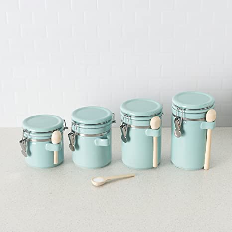
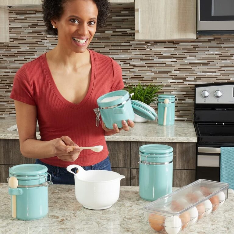
Retro Turquoise Canister Set
Nostalgia Aqua Retro Breakfast Station
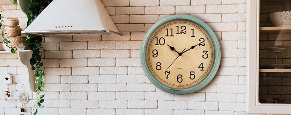
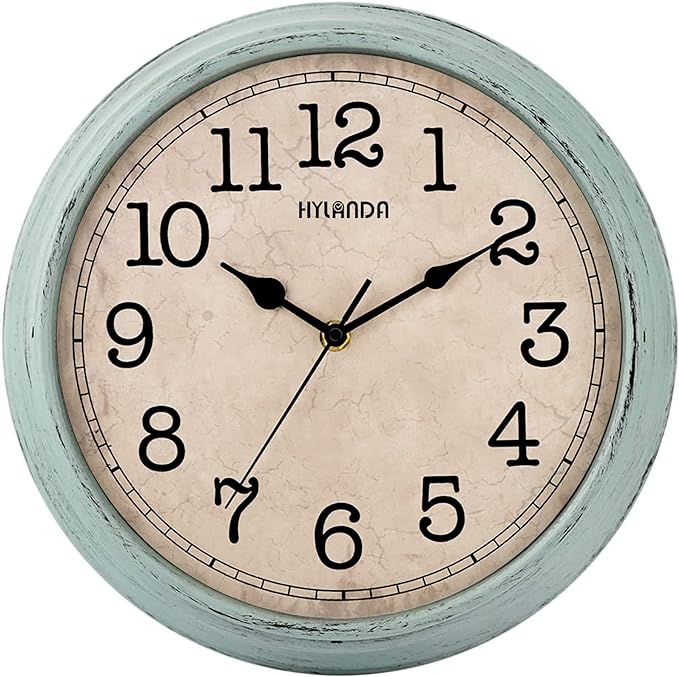
Hyland Sage Retro Wall Clock
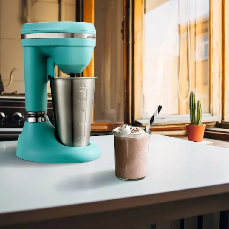
Brentwood Turquoise Milkshake Maker
How to Use These Colors Together
When it comes to using these colors in design, the key is to find balance and harmony. Here are some tips for combining teal, turquoise, aqua, and cyan:
- Create a Gradient: Use these colors to create a gradient effect that flows smoothly from one hue to the next. This can add depth and dimension to any design.
- Accent Colors: Choose one color as the main hue (like teal or turquoise) and use the others as accent colors. This will help maintain a cohesive look while still incorporating the vibrancy of the palette.
- Nature-Inspired Designs: Given their associations with water and the outdoors, these colors can be used to create serene, nature-inspired spaces that promote relaxation and tranquility.
- Modern Aesthetics: In contemporary designs, combining these colors with stark whites or sleek metals can create a fresh, modern aesthetic that feels both playful and sophisticated.


Teal, turquoise, aqua, and cyan each have their own personality and can significantly influence the mood of a space or design. Understanding the differences between these colors allows for more intentional choices in art, fashion, and interior design. Whether you’re looking to evoke a sense of calm with teal, add vibrancy with turquoise, create playfulness with aqua, or inject energy with cyan, there’s a perfect shade for every occasion. So go ahead and embrace these stunning hues in your next creative project!



One Comment